Perspective Drawing
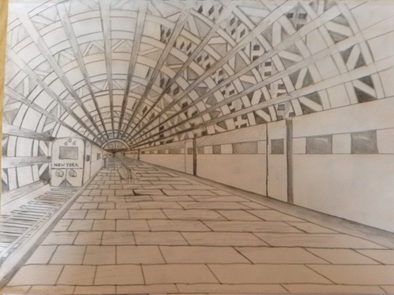
For my perspective drawing project that we did in art 2 class. I really tried to bring out the perspective in my piece. In order to make my drawing more appealing I darkened the vanishing point in my drawing and as you got further away from the vanishing point the value of the drawing got lighter. I really like the way I made the train on the left with the train tracks. The most challenging in this drawing was trying to visualize the value and what to add to the drawing and what not. I enjoyed doing a perspective drawing and I know and can improve on keeping my lines straighter and knowing the value of the items in my drawing.
values and shapes
|
|
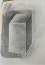
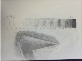
The drawing on the left is a shape drawing of rectangle. In class we were trying to find the light and were the value should be when we establish the light source. The drawing on the right is a value chart which helps me to know the different values of the pencil. There is also a drawing of a cone in the picture on the right which we did after we drew the value chart.
Apple
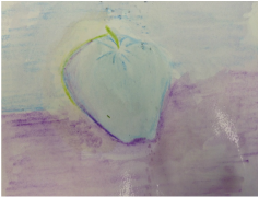
In class we painted with water color which wasn't my first time, but I was disappointed with my outcome. Background in this painting is with color pencil then brush with water to fill in the white color of paper behind. I believe I can excel with watercolor and become a better painter.
up close nature project
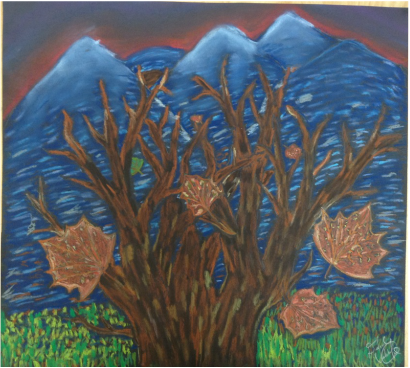
In art 2 we worked on Up Close Nature Project. For the materials I used was chalk pencils. This project was very challenging visualizing the value and the direction of where the chalk should be put. I learned it's essential to build up the chalk in order to put a value on the object. I was already familiar with the chalk pencils and with them I learned not to smooth it with my fingers and leave it how I put it on the paper. I took some risk on the mountains and the grass in the background. I was unfamiliar on what to do with the shape and colors of the mountains. I loved how the leaves were completed and the tree was hard to visualize at first but once my teacher showed me how to put the different colors and value of the tree to put detail on it. I asked my neighboring student what I should do with the sky above the mountains and she suggested that I go with a sunrise to emphasize the cold and morning time of the day of the mountains. My teacher suggested for the grass that I draw big lines in the front of the painting then shorten them when I go further in the middle of the drawing. I found information from Georgia O'Keefe in one of her canvases she had the mountains blue to show the value and the perspective of the mountains to the front of her canvas. When I finished I stepped back to visualize my drawing. I was very proud of my leaves and the tree especially. This project was very enjoyable and I hope to do another chalk drawing.
Colored Apples Stketches
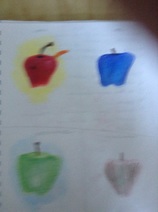
In class we experimented on drawing apples. We included on the different color components like warm colors, cool colors, monochromatic colors, and complementary colors.
up close nature SKETCHES
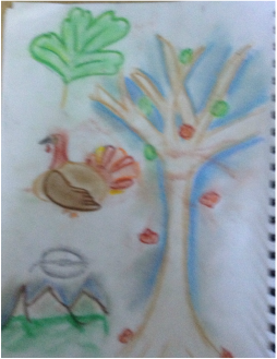
In class we were doing up close nature drawing to help us with are project. I was working with chalk pastels with these drawings. These drawings were not even close to my project which looked awesome. These drawings help me what not to do on the project.
clay sketches
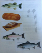
In this picture I looked online on what fish look like. I saw the specific type of scales for each type of fish has. The bread was the another idea I had and I have bread pictures of the shape and crusty look bread has. I drew the candy cane to maybe but candy into my clay project.
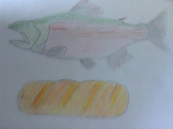
These are drawing of my pictures that I took for my clay project. It was challenging to get the shaped and the different type of colors the fish and the bread have.
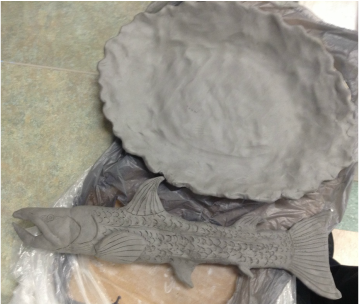
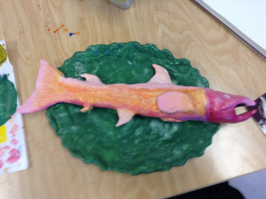
This is my clay project in progress report for my class. I don't know yet on what colors to put on the fish or the plate. i would want colors that would blend very well together to the fish and maybe one color for the plate. I like how I got the shape of the fish very well I can't wait to start glazing it.
Research famous artist project
Wayne Thiebaud was born on November 15, 1920 in Mesa, Arizona. During this time period it would have been difficult to choose such a profession as being an artist. Being said, Wayne became a teacher for Sacramento City College. Wayne is not as talented as Picasso or Michelangelo but there is something about his paintings that pop out. One of the reasons people love Wayne's work is people believe that they can go up to his paintings and lick it. This portrays a realistic characteristic Wayne uses heavy pigment to emphasize his colors to unlock his objects.
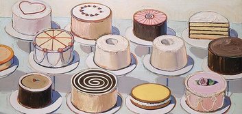
Cake Window painting was done in 1964. This painting consist of pies and cakes on a stick. This is one of his paintings that looks very realistic to the naked eye and looks like you want a piece of the pie.
|
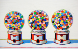
The Three Machines was painted in 1963. This artwork is now in De Young Museum, San Francisco. This painted portrays three gumball machines. Each gumball has its own color or its own favor.
|
part of art painting
In art class our teacher gave us a piece of a famous painting. She didn't tell us that it was a famous painting so we didn't get discouraged. Once we all finished we had to go around the classroom and find other students that has a piece of the famous painting that she gave to us. it was amazing to see how good we all did because these paintings that we put together were all famous and to know that we can accomplish feats as these famous artist accomplished.
Clay Project
|
In art class we had to create food out of clay. I choose to do a fish with a plate. One unique idea I had for the fish was to have a red head. My source of inspiration for this project is am Roman Catholic and the main food they eat in the Bible is fish so I decided to make a fish. Doing this project I learned that you cannot have acrylic paint and try to glaze it. I also learned to blend the colors in between each other to make it look more realistic. Doing this project I asked my peers and my teacher for any suggestions and how they thought of my fish. My teacher has inspired me to work harder on the detail and patience of when doing any type of art. Some of the problems I had during this project was trying to get the right color of the fish and trying to blend the colors I put on the fish. My teacher showed me to take the lighter of the two colors and lightly brush over the darker color. When I first started to paint I put on a orange color before I put on the color I wanted to put on the fish. This technique didn't work as I planned but I was able to paint over everything with a white color to start over. When I first started to analyze my project it was when I realized that the orange undercoat and the paint I put on after it was not what I wanted to look like.
|
Famous painting
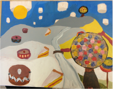
In art class we had to do a painting in a famous artist style. The artist I got was Wayne Thiebaud and he was a artist who painted deserts. I took that idea and created a world of his deserts. The yellow paint on the mountain side is the filling in a cake to make the world on big cake. From trying to paint in Wayne perspective it was easy because everything didn't have to be perfect you could have icing on the side dripping or running down the side of a piece of cake. My source of inspiration was when I was little I saw the Shark-boy and Lava-girl movie and in a part of the movie there was a land of deserts and milk rivers so I took that and Wayne Thiebaud's artist style to create a fantasy land of deserts. Some risks I took was the marshmallows in the sky I was going to a regular sky but the marshmallows turned out nice. I picked the paint mixer trail not also to mix my paint but to put it on my painting for a texture of thickness like spreading icing on a cake. I asked my peers around me and they also like the idea and gave me suggestions on what to do. One of the suggestions they gave me was to darken the river to show more of the depth of it. A problem of this project was trying to control the paint so I learned to take my time and to only take a little paint as a time. This project was new for me because I've never painted so intensely as I have done before. I believe I could have done a lot better and look forward to the next project to become better at art.
Print-Make Project
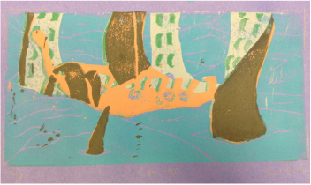
In art class we had to create an image with print making. The materials we used was ink, linoleum, byre, and a linoleum cutter. First we had to draw out our image on a sheet of paper. Once completed we had to trace the image onto tracing paper which after we flipped over the tracing paper with the lead and transferred that onto the linoleum. Once we had the image onto the linoleum we had cut out the color of our background. Then we could start printing with the ink. We started with the lightest colors first then cut the darkest colors last. For instance the lightest color on my print is light blue so I printed first that type of ink color. After we would print our lightest color then we would then cut out whatever was the next lightest color on the colors we choose for our print project. After that all you do is rinse and repeat.
For my print I used folktale of the kraken. I included the vikings into the print because it went well with the time period for with the kraken and the vikings were known to slay mythical creatures. I got the idea of the kraken from two sources. The sources were from the movies Spectre and Pirates of the Caribbean. I took the kraken out of the movies onto my print because it went well with the theme of the print project. I learned with ink is you need a lot of ink to get a clear picture but not to much or the ink will smudge. Making the print perfectly aligned was a challenge if there was anything different I would do it would be to pick a method which help the alignment of putting the ink onto the paper. Around the house I would help my dad with chores such as painting, so I was familiar with the byre's and how the tool worked. This wasn't my favorite project to do of the overall projects but this was also a challenging project on the alignment of the paper and linoleum when your printing. Even though I struggled on the alignment I still tried to make a good image.
For my print I used folktale of the kraken. I included the vikings into the print because it went well with the time period for with the kraken and the vikings were known to slay mythical creatures. I got the idea of the kraken from two sources. The sources were from the movies Spectre and Pirates of the Caribbean. I took the kraken out of the movies onto my print because it went well with the theme of the print project. I learned with ink is you need a lot of ink to get a clear picture but not to much or the ink will smudge. Making the print perfectly aligned was a challenge if there was anything different I would do it would be to pick a method which help the alignment of putting the ink onto the paper. Around the house I would help my dad with chores such as painting, so I was familiar with the byre's and how the tool worked. This wasn't my favorite project to do of the overall projects but this was also a challenging project on the alignment of the paper and linoleum when your printing. Even though I struggled on the alignment I still tried to make a good image.
Mix Media Project
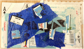
In class we did a mix media piece. This was a fun project to do because you could anything you found from media, magazines, etc and used that to create a collage of random. I did a Batman and Joker theme. The entire collage is a card which has the batman in the middle cut up into pieces. The joker has only his waist down showing clearly. He also symbolizes a deck of cards because in a deck of cards there is two jokers that come with it. I recently went to a North Carolina Basketball game and I brought the tickets to school to put them into the mix media.
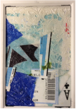
This is a piece of the Mix media above. This shows the ace of clubs with some pieces of the North Carolina tickets and Batman. When I was working on this I was not sure with the blue I put in the mix media was necessary. I should have put more paper under the pieces of Batman and Joker so people could easily see what this mix media piece was about. This piece is very reflective of the light shining on it because there is a lot of glue which makes it shine more.
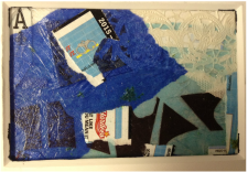
This piece is also another part of the mix media piece. This piece is located more in the middle of the larger piece. This shows half of the Batman symbol. the big "A" in the top left, and pieces of the North Carolina tickets. This piece has a lot of value. On the left you can see that the light is shining from that side and hs you move right of the piece the light weakens and the colors darken. This project was enjoying to do. out of the three pieces shown here my favorite is the last one with showing half of batman and the ace symbol in the left corner of the piece.
